Where your church Christmas graphics should go, and what each one has to do
By Tom Harris · AI Church Graphics · Updated
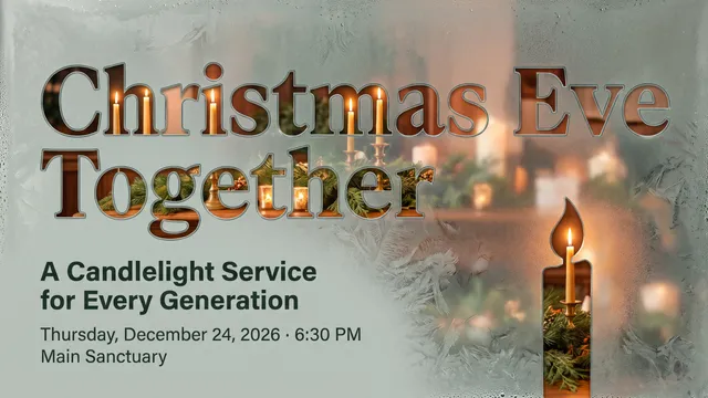
A church Christmas graphic is a tool. It helps a specific person do a specific thing. A member invites a coworker. A mom finds the 4:00 family service. A nervous first-time guest decides your church is safe to walk into. Each place you put a graphic has a different person and a different job, so design it for that job.
Start with one approved set of facts (what, when, where and who it’s for) and one web page that holds all of it. Then adapt the design to each place below instead of copying one file everywhere.
1. Your website: where a guest checks before deciding
A guest hears about your Christmas Eve service from a friend, then looks you up. Put the Christmas schedule on your homepage with a link to a dedicated page that has the address, parking, childcare, what to expect, service length, and how to ask a question. Add a short, plain statement of what your church believes and why you exist. In Lifeway Research’s 2023 study of people who switched churches, those who first found their church through its website said its beliefs and mission were the most helpful thing on it (67%), followed by its location (66%) and worship times (64%).
Put the key words in the page text, not only inside the image. Screen readers, search engines and copy-and-paste all need text. Check the page on a phone, because that’s where many guests will see it.
2. Members’ phones: the Christmas Eve invitation they’ll actually send
Many churches skip this placement, yet it may matter most. Give every member a vertical, phone-sized Christmas Eve invitation image with the service name, date, time and web address, and ask them to text it to one person. In a 2016 Lifeway Research survey of 2,000 unchurched Americans, 51% said an invitation from a friend or neighbor would be effective in getting them to visit, and 55% said the same of an invitation from a family member; a postcard scored 23% and a Facebook ad 18%. The graphic’s job here is to make the friend’s yes easy: everything they need to show up is on the image.
Send the image to members by email and text on your launch weekend, and again in the week of December 14.
3. Facebook and Instagram: invite, explain, remind
For a feed post, lead with one message and keep the words on the image short. Put the why and the link in the caption. Stories work for quick reminders as long as the service time sits in the readable middle of the frame, away from the buttons. Change the purpose of your posts through Advent: an invitation, a first-timer explainer, a story from your people, then the invitation again. Before you schedule anything, look at it on an ordinary phone without zooming. If the service times are hard to read, move them to the caption.
4. Church announcement slides: three different moments
Prepare three versions, because the room is doing three different things:
- Pre-service loop: the full Christmas schedule, large enough to read from the back row.
- Announcement slide: one event, its date and time, and the invitation line the pastor will say out loud.
- Series title slide: the visual theme alone, with no logistics.
Test on the actual screen in the actual lighting. A title slide doesn’t automatically work behind song lyrics; a lyric background needs contrast and empty space. During a candlelight moment, a quiet image serves the room better than a schedule.
5. The lobby and the building: put signs where decisions happen
A lobby poster belongs where people stop. A small invitation card belongs at the welcome desk and the exits so a member can take one for a friend. A direction sign belongs where a guest has to choose: the parking entrance, the kids’ check-in hallway. Then ask someone who’s never been in your building to walk in and find the Christmas Eve service details. Wherever they hesitate, you need a sign or a simpler message.
6. Email and text: the schedule people search their inbox for
Send one logistics email in the week of December 14 with the schedule laid out line by line, in text rather than inside an image, so people can find it when they search their inbox on December 24. A short text the day before with the time and address reaches the people who rarely open email, and it’s the easiest message for them to forward to a friend.
Keep one source of truth
Write the approved details once. Keep a checklist of every placement: website, member invitation image, social scheduler, screen slides, lobby print, email and text. If a time changes, one person updates every item on that list. A good-looking graphic that spreads an outdated time undoes a month of work. The week-by-week schedule for all of this is in our 2026 church Christmas communication plan.
One design, ten downloadable sizes
If you need several sizes of one design, AI Church Graphics’ full design package gives you one chosen Christmas graphic in all ten downloadable sizes — one design in ten sizes, not ten different designs. Each size in a different shape is redrawn for that shape in your design’s style, never stretched, with your words checked on every size. This is where each size fits:
- Worship screen: Sermon Graphic, 16:9 at 4K (PNG).
- Website: Web Banner, 1920×640 (PNG).
- Video: Thumbnail for YouTube, 1280×720 (PNG).
- Social feed: Social Square Post, 1080×1080 (PNG), and Social Portrait Post, 1080×1350 (PNG).
- Members’ phones and stories: Story / Reel Cover, 1080×1920 (PNG).
- Invitation cards to hand out: Invite Card, 3.5×2 in, front and back (print PDFs and PNGs).
- Handouts: Half Sheet, 5.5×8.5 in (print PDF and PNG).
- Flyers and bulletin inserts: Full Sheet, 8.5×11 in (print-ready PDF).
- Lobby: Lobby Poster, 18×24 in (print-ready PDF).
Check every size against your real details, especially the phone text and the screen version, before anything goes public.